Generic Mapping Tools 3
Geophysicists usually need to make maps in order to display geophysical data. The next two labs will show you various ways that you can do this in GMT. Today we will examine how to display point data on a map (i.e. we have data that has been collected for a certain number of discrete locations), and the final GMT lab we will look at grid-registered data (i.e. data that has been collected for every point gridded over an entire region).
Displaying Point Data
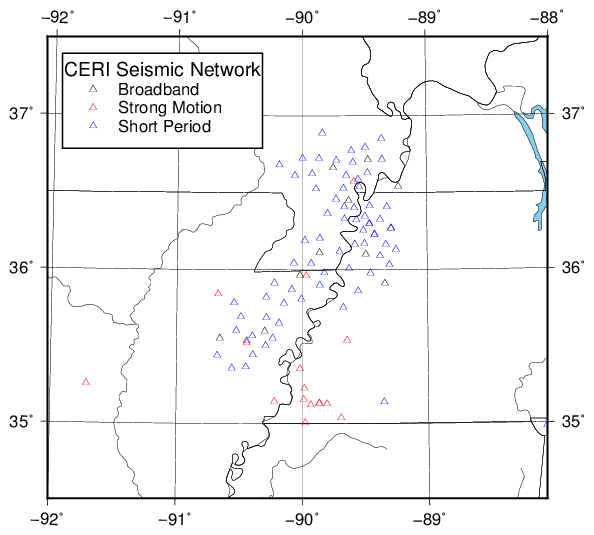
The simplest type of plot for a point data set is a collection of locations. An example of this might be locations of seismic stations. Here is a plot of the CERI New Madrid Seismic Network, which should be produced by the shell script gmt3.csh from the data files ceribroadband.txt, ceristrongmotion.txt, and cerishortperiod.txt.
The code to produce this plot is as follows (GMT 4):
set files = ( "ceribroadband.txt" "ceristrongmotion.txt" "cerishortperiod.txt")
set colors = ("black" "red" "blue")
set legendtext = ("Broadband" "Strong Motion" "Short Period")

pscoast -R-92/34.5/-88/37.5r -JB-90/36/34.5/37.5/5i -Ba1g1 \
    -Dh -N2 -Ir -Cskyblue -W -K -P > gmt3_1.ps
foreach i ( 1 2 3 )
    awk '$0 !~ /Station/ {print $4, $3}' $files[$i] | \
            psxy -R -J -St6p -W$colors[$i] -K -O -P >> gmt3_1.ps
end
pslegend << END -R -J -Dx0.15i/3.5i/2i/0.95i/LB \
    -F1p,black -Gwhite -O -P >> gmt3_1.ps
H 14 0 CERI NMSZ Network \\
S 0.25i t 6p - $colors[1] 0.5i $legendtext[1]
S 0.25i t 6p - $colors[2] 0.5i $legendtext[2]
S 0.25i t 6p - $colors[3] 0.5i $legendtext[3]
END
and in GMT 5:
set files = ( "ceribroadband.txt" "ceristrongmotion.txt" "cerishortperiod.txt")
set colors = ("black" "red" "blue")
set legendtext = ("Broadband" "Strong Motion" "Short Period")

gmt pscoast -R-92/34.5/-88/37.5r -JB-90/36/34.5/37.5/5i -Bxa1g1 -Bya1g1 \
    -Dh -N2 -Ir -Cskyblue -W -K -P > gmt3_1.ps
foreach i ( 1 2 3 )
    awk '$0 !~ /Station/ {print $4, $3}' $files[$i] | \
            gmt psxy -R -J -St6p -W$colors[$i] -K -O -P >> gmt3_1.ps
end
gmt pslegend << END -R -J -Dx0.15i/3.5i+w2i/0.95i+jLB \
    -F+gwhite+p1p,black -O -P >> gmt3_1.ps
H 14 0 CERI NMSZ Network \\
S 0.25i t 6p - $colors[1] 0.5i $legendtext[1]
S 0.25i t 6p - $colors[2] 0.5i $legendtext[2]
S 0.25i t 6p - $colors[3] 0.5i $legendtext[3]
END
Using variables, these commands are written as:
set code = "pscoast -R${xmin}/${ymin}/${xmax}/${ymax}r -JB${clon}/${clat}/${minlat}/${maxlat}/$size"
set code = "${code} $bvals -D$resolution $natbounds $rivers -C${lakes} $continents $firstplot $portrait > $outfile"
eval "$code"

foreach i ( 1 2 3 )
awk '$0 !~ /Station/ {print $4, $3}' $files[$i] | \
    psxy -R -J -S${symb}${symsize} -W$colors[$i] $midplot $portrait >> $outfile
end

pslegend << END -R -J ${legscale} \
    ${legvals} $finalplot $portrait >> $outfile
H $headerfont 0 $header
S $legendoffset1 $symb $symsize - $colors[1] $legendoffset2 $legendtext[1]
S $legendoffset1 $symb $symsize - $colors[2] $legendoffset2 $legendtext[2]
S $legendoffset1 $symb $symsize - $colors[3] $legendoffset2 $legendtext[3]
END
Note that I broke up the command to create a variable holding the pscoast onto two lines to make it more readable – you cannot put line breaks into variable definitions, so this is a better way to handle long commands that need to be saved to a variable. Also note that I used a loop in calling psxy to draw the stations on the map, using arrays to handle the parts of the variable that change through the loop.
This plot involves several calls to GMT. I will describe them one at a time.
The first call to
pscoastdraws the map outlines and gridlines. These should all be familiar based on the last GMT lab. If not, refer back to the examples from the previous labs. We use a new conic projection (the Albers Conic projection), which takes the same arguments as the Lambert Conic projection that we used in the last lab.The next three calls read \({x}\)-\({y}\) data from text files containing station information for the CERI New Madrid Seismic Zone Network. I use AWK to format the data to be used by
psxy(here just longitude and latitude coordinates for each station). The options forpsxywere discussed in the first GMT lab. Here we use triangles (-St6p) to plot stations (triangles are often used on maps to represent seismic stations).The final command uses
pslegendto draw a legend on the plot, giving the legend data using standard input.pslegendtakes several options. First are-R -J, which define the region and map projection. After that, the-Doption describes how to draw the legend on the map. You can draw the legend either using map coordinates (degrees) or page measurement units (inches, centimeters, etc.). Here I choose to use page units by prepending thexbefore the measurements. The next four numbers give the \({x}\) and \({y}\) location (relative to the lower left corner of the plot) and then the length and width of the legend box (GMT 5 requires you prepend+wto designate the size of the box). Finally, theLBcharacters at the end describe the reference point for the location measurements (LBmeans that the \({x}\) and \({y}\) location specified in the call refer to the location of the lower left corner of the legend). GMT 5 requires that you place a+jbefore these characters.How to specify the style of the legend box is different between GMT 4 and GMT 5. For GMT 4,
-F1p,blacksays to draw a rectangular outline in black with a thickness of one point (1/72 inch), and-Gwhitesays to color the legend box white. GMT 5 requires this information all go under the-Foption with the format-F+gwhite+p1p,black.The remaining options have been discussed previously.
After the command comes the legend text. Each line begins with a character describing the meaning of the line, and then the details of how to draw that line. The first line begins with
H, which means that this line contains header text (the legend title). The text that follows (14 0 CERI NMSZ Network) means to write “CERI NMSZ Network” in font 0 (Helvetica) with a size of 14 points.The following three lines begin with
S, meaning that they describe symbols to be draw in the legend. the next 5 entries are0.25i t 6p - $colors[1], which describe how to draw the symbol. This means: 0.25 inches from the left of the legend box (0.25i), draw a triangle (t) with a size of 6 points (6p) with no fill (-) and a black outline ($color[1], in this case black). After that comes another measurement unit and a text line: the text will be displayed that distance from the left side of the legend box, so in this case the text$legendtext[1](“Broadband” in this case) is displayed 0.5 inches from the left side. The other symbol lines are the same as the first one.
As you can see, legends are a bit tricky. If you have trouble getting the legend to display correctly, you can always draw the symbols and text manually using psxy and pstext (a trick I use in some of the examples below).
Displaying Point Data with Size and Color Data
Sometimes, we have point data that are not all uniform, and would like to display this information using the size and color of the points. We can do this using GMT, as illustrated in the following example, which produces the following plot of earthquake epicenters (gmt3_2.pdf):
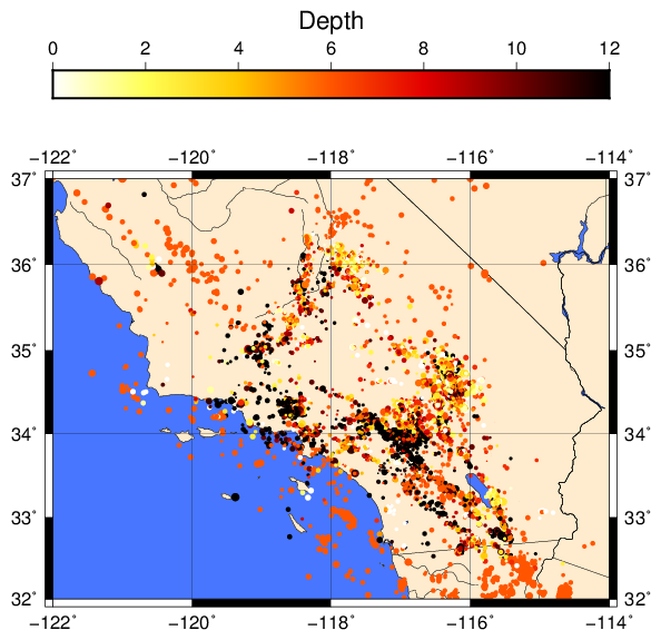
This file uses the earthquake catalog for Southern California for 1999 (1999.catalog), and is produced with the following commands in GMT 4:
pscoast -R-122/-114/32/37 -JM5i -Dh -Gblanchedalmond -Sroyalblue1 \
    -N1 -N2 -Ir -W -K -P > gmt3_2.ps
makecpt -Chot -I -T0/12/2 -Z -D > quake.cpt
awk '$0 == "" { next } $0 !~ /#|(year)/ { minus = match($8,/-/); \
    print substr($8,minus)-$9/60, $7+substr($8,0,minus-1)/60, $12, $11*0.05 }' \
    1999.catalog | psxy -R -J -Sc -Cquake.cpt -K -O -P >> gmt3_2.ps
psbasemap -R -J -Ba2g2/a1g1 -K -O -P >> gmt3_2.ps
psscale -Cquake.cpt -D2.5i/4.75i/5i/0.25ih -Al -B2:"Depth": -O -P >> gmt_2.ps
while in GMT 5, the commands are:
gmt pscoast -R-122/-114/32/37 -JM5i -Dh -Gblanchedalmond -Sroyalblue1 \
    -N1 -N2 -Ir -W -K -P > gmt3_2.ps
gmt makecpt -Chot -I -T0/12/2 -Z -D > quake.cpt
awk '$0 == "" { next } $0 !~ /#|(year)/ { minus = match($8,/-/); \
    print substr($8,minus)-$9/60, $7+substr($8,0,minus-1)/60, $12, $11*0.05 }' \
    1999.catalog | gmt psxy -R -J -Sc -Cquake.cpt -K -O -P >> gmt3_2.ps
gmt psbasemap -R -J -Bxa2g2 -Bya1g1 -K -O -P >> gmt3_2.ps
gmt psscale -Cquake.cpt -D2.5i/4.75i/5i/0.25i+h+jCT+m -Bx2+l"Depth": -O -P >> gmt_2.ps
Using the variable names defined in the shell script, the actual commands are:
pscoast -R${xmin}/${xmax}/${ymin}/${ymax} -JM$size -D$resolution -G$land -S$ocean \
        $natbounds $rivers $continents $firstplot $portrait > $outfile
makecpt -C$cmap $cinv -T${cmin}/${cmax}/${cint} $cmapcontinuous $cmapoutliers > $cmapfile
awk '$0 == "" {next} $0 !~ /#|(year)/ {minus = match($8,/-/); \
    print substr($8,minus)-$9/60, $7+substr($8,0,minus-1)/60, $12, $11*'"$symbscale"'}' \
    $infile | psxy -R -J -S$symb -C$cmapfile $midplot $portrait >> $outfile
psbasemap -R -J $bvals $midplot $portrait >> $outfile
psscale -C$cmapfile $scalvals $bvalscmap $finalplot $portrait >> $outfile
This involves several new commands, plus some old ones used in a new way.
pscoastdoes not involve anything new. See the previous lab notes if you do not understand something.makecptis a command to make a color palette to plot color data on a map. Here, we create a color palette for plotting our earthquake based on their depth. GMT has several built-in color scales (you can see the list by typingmakecptwith no arguments into the command line). I choose the “hot” scale by giving the-Chotoption. However, we need to re-scale the color scale to our data to use it in the plot, which is why we callmakecpt. I give the optionsIto invert the scale (I want shallow earthquakes to be yellow and deep to be black; since depth is a positive quantity this is backwards),-Zto make the color scale continuous (as opposed to discrete), and-Dto set events that are off scale to be the maximum and minimum colors in the colorscale.The final option is
-T0/12/2, which sets the minimum and maximum values in the color scale range and the increment. The increment is unnecessary here because I chose a continuous color scale, but if you want a discrete color scale this determines the number of colors. You can also give-Ta file containing all of the values in your data, and it will scale the color palette to the maximum and minimum values in the dataset.The color palette is redirected to file as
quake.cpt, which we will use in additional GMT calls that follow.Next, we plot the data using
psxy. Because we would like to set the color from the color palette file, and we would like to scale the marker size by the event magnitude, I give 4 values topsxy(longitude, latitude, depth, and magnitude) using AWK to pull the data from the file. This particular AWK program is a bit complicated because of the way the data is formatted (there is no space between the latitude and longitude, so I need to usematchandsubstrto break the field into two parts). When you callpsxywith four entries, then the third defines the color and the fourth defines the size. Thus, my plot will show the epicenter as a circle, where the size represents the event magnitude and the color represents depth. Note also that I had to combine single and double quoting when writing my AWK program so that$symbscaleis correctly expanded to be fed into the AWK program, but the other uses of$1, etc. are not owing to my use of quotes. If you are unsure as to why I have to do this, review the notes for the first class on shell scripting.The additional options on
psxyare-R -Jto use the preceding region and projection,-Scto draw the symbols as circles (note that I do not give a size so that GMT knows to use the data columns to determine the size),-Cquake.cptto use the color palette to color the circles (note that I do not provide-Gto fill the symbols, so GMT knows to use the data in the input file to set the color), and-K -O -Pfor portrait mode and to append code to a previous file, and to alert GMT that I will append more code to this plot.psbasemapshould be familiar to you. I call it here so that the grid lines are overlaid on the earthquake epicenters.psscaledraws the colorbar on the figure. Options are:-Cquake.cptsays to use the color palette from before, and the-Doption tells GMT where to draw the colorbar. The command is slightly different between GMT 4 and GMT 5. In both cases, the first two numbers are the \({x}\) and \({y}\) distances from the lower left corner of the plot (relative to the center top of the colorbar), then the next two are the width and height (GMT 5 requires the string+wbefore them). So the colorbar is 2.5 inches to the right and 4.75 inches up from the bottom left corner of the plot. GMT 5 requires that you specify the anchor point, which we give using+jCTto ensure compatibility with GMT 4, where that location is the default. The finalhsays to make a horizontal colorbar (default is vertical), and GMT 5 requires a+before thehfor it to be recognized properly.-Altells GMT to put the label on the opposite side of the colorbar in GMT 4. GMT 5 instead appends a+mto the-Doption. Default is to have both the labels and annotations on the bottom side for a horizontal colorbar, and on the right for a vertical colorbar.-B2:"Depth"or-Bx2+l"Depth"sets the annotation frequency and the label. The rest of the options are ones you have seen before.
As this example shows, you can make very complicated plots using GMT, and have control over a large number of details. Hopefully you get the idea of how all of this works so that you can modify this code should you want to produce a map like this example.
Earthquake Focal Mechanisms
Another common data type that seismologists often want to show on a map is an earthquake focal mechanism. While the official GMT programs do not include a command to plot focal mechanisms, others have developed a focal mechanism program (psmeca) that is now included with the other GMT commands. psmeca can plot focal mechanisms in a variety of formats. Here, I show you examples of two of them in the plot gmt3_3.pdf created by the shell script.
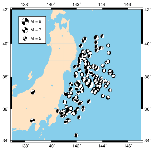
These are the focal mechanisms of magnitude 5 and greater earthquakes starting with the 2011 \({M=9}\) event off of Japan and continuing for 3 months after the event. Here is the code to produce the plot, using the file japancmt2011.txt:
pscoast -R137/147/34/42 -JM5i -B2 -Gbisque -Sskyblue -Df -K -P > gmt3_3.ps
psmeca japancmt2011.txt -R -J -Sm0.15i -K -O -P >> gmt3_3.ps
pslegend << END -R -J -Dx0.25i/3.75i/1.05i/1.05i/LB -F1p,black -Gwhite \
    -K -O -P >> gmt3_3.ps
G 0.04i
S 0.25i c 1p - white 0.4i M = 9
G 0.11i
S 0.25i c 1p - white 0.4i M = 7
G 0.11i
S 0.25i c 1p - white 0.4i M = 5
END
psmeca << END -R -J -Sc0.15i -O -P >> gmt3_3.ps
138 41.3 0 180 90 0 90 90 0 4 29 138 41.3
138 40.8 0 180 90 0 90 90 0 4 26 138 40.8
138 40.3 0 180 90 0 90 90 0 4 23 138 40.3
END
And for GMT 5, the commands are:
gmt pscoast -R137/147/34/42 -JM5i -Bx2 -By2 -Gbisque -Sskyblue -Df -K -P > gmt3_3.ps
gmt psmeca japancmt2011.txt -R -J -Sm0.15i -K -O -P >> gmt3_3.ps
gmt pslegend << END -R -J -Dx0.25i/3.75i+w1.05i/1.05i+jLB -F+gwhite+p1p,black \
    -K -O -P >> gmt3_3.ps
G 0.04i
S 0.25i c 1p - white 0.4i M = 9
G 0.11i
S 0.25i c 1p - white 0.4i M = 7
G 0.11i
S 0.25i c 1p - white 0.4i M = 5
END
gmt psmeca << END -R -J -Sc0.15i -O -P >> gmt3_3.ps
138 41.3 0 180 90 0 90 90 0 4 29 138 41.3
138 40.8 0 180 90 0 90 90 0 4 26 138 40.8
138 40.3 0 180 90 0 90 90 0 4 23 138 40.3
END
where I have used variables to make the original commands the following:
pscoast -R${xmin}/${xmax}/${ymin}/${ymax} -JM$size $bvals -G$land -S$ocean -D$resolution $firstplot $portrait > $outfile
psmeca $infile -R -J -Sm$m5size $midplot $portrait >> $outfile
pslegend << END -R -J $legscale $legvals $midplot $portrait >> $outfile
G $legendvoffsets[1]
S $legendhoffsets[1] $legendsymb $legendsymsize - $legendbackground $legendhoffsets[2] $legendlabels[1]
G $legendvoffsets[2]
S $legendhoffsets[1] $legendsymb $legendsymsize - $legendbackground $legendhoffsets[2] $legendlabels[2]
G $legendvoffsets[2]
S $legendhoffsets[1] $legendsymb $legendsymsize - $legendbackground $legendhoffsets[2] $legendlabels[3]
END
psmeca << END -R -J -Sc$m5size $finalplot $portrait >> $outfile
$legendmecx $legendmecy[1] $legenddep $legendmec $legendmantissa $legendexp[1] $legendmecx $legendmecy[1]
$legendmecx $legendmecy[2] $legenddep $legendmec $legendmantissa $legendexp[2] $legendmecx $legendmecy[2]
$legendmecx $legendmecy[3] $legenddep $legendmec $legendmantissa $legendexp[3] $legendmecx $legendmecy[3]
END
The commands do the following:
pscoastshould be familiar to you. There is nothing new here.psmecareads focal mechanism information from the filejapancmt2011.txt. The file is already in the appropriate format, so I do not need to use AWK to reformat. In this case, the format islon lat dep mrr mtt mpp mrt mrp mtp exp lon1 lat1 text
where the fields have the following meaning: event longitude, event latitude, event depth, 6 component trace-free moment tensor in Harvard CMT format, plus an exponent (assumes seismic moment is in dyne-cm), then the latitude and longitude location for the symbol (I use the same location as the event), and an optional text tag. If you give a location that differs from the event location, the event location will be shown with a small dot that is connected to the beach ball by a line. This is one of the standard formats that you can download from the web (you will use this format to plot focal mechanisms in the homework).
The other options in
psmecashould be familiar with the exception of-Sm0.15i. This option tellspsmecathe format for the focal mechanisms (themspecifies the format the I just described), and the size (0.15icorresponds to the size of a \({M=5}\) event). If you want all events to have the same-sized beach ball, use the-Moption.Next, I use
pslegendto make a legend, where I will illustrate how the size corresponds to magnitude. Sincepsmecais not an official GMT program, there is not an option withinpslegendto draw a focal mechanism. Therefore, I will just plot a legend with no symbols, and draw my own symbols usingpsmeca. The syntax here is mostly identical to the previous use in the first example. The only difference is my use of theGoption in the legend text.G 0.04itells GMT to put a vertical gap of 0.04 inches into the legend, and I use this to get my text lined up with the focal mechanisms that I am about to draw. theSlines give the “symbols” that I wish to draw, but since I use a white pen on a white background, the symbols do not show up and I can just add the desired text to the legend in the desired place.Finally, I call
psmecaagain to place focal mechanisms on the legend. This time I use the format where I specify the two nodal planes using strike, dip, and rake for each plane (-Sc0.15ispecifies this format), followed by the mantissa and exponent of the moment in dyne-cm. Since these are only supposed to be representative of size, I draw pure strike-slip mechanisms for each (strike of \({180^\circ}\) and \({90^\circ}\), dip and rake of zero in both cases). The moments are chosen to give magnitudes 9, 7, and 5 for the three representative symbols. The other entries (latitude, longitude, depth, and plot position) are the same for all formats. Other options forpsmecashould be familiar from the discussion above.
GPS Velocity Vectors with Errors
The final type of point data that we consider in this lab is GPS velocities. GMT has another supplemental program psvelo for plotting velocity vectors and error ellipses. Using the file pbo_velocities.txt, the shell script will produce the following plot:
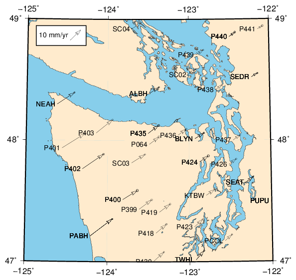
The GMT 4 code for this plot is:
pscoast -R-125/-122/47/49 -JT-123.5/48/5i -B1 -Df -Gblanchedalmond \
    -Sskyblue -W -K -P > gmt3_4.ps
awk '/^ [0-9A-Z]{4}/ {print $9, $8, $21, $20, $24, $23, $26, $1 }' \
    pbo_velocities.txt | psvelo -R -J -Se30i/0.95/10 \
    -W -K -O -P >> gmt3_4.ps
pslegend << END -R -J -Dx0.25i/4.35i/1i/0.4i/LB -F1p,black -Gwhite \
    -K -O -P >> gmt3_4.ps
G 0.05i
L 10 - LB 10 mm/yr
END
psvelo << END -R -J -Se30i/0.95/10 -W -O -P >> gmt3_4.ps
-124.475 48.825 0.00707 0.00707 0 0 0
END
and the GMT 5 code is:
gmt pscoast -R-125/-122/47/49 -JT-123.5/48/5i -Bx1 -Bx2 -Df -Gblanchedalmond \
    -Sskyblue -W -K -P > gmt3_4.ps
awk '/^ [0-9A-Z]{4}/ {print $9, $8, $21, $20, $24, $23, $26, $1 }' \
    pbo_velocities.txt | gmt psvelo -R -J -Se30i/0.95/10 \
    -W -K -O -P >> gmt3_4.ps
gmt pslegend << END -R -J -Dx0.25i/4.35i+w1i/0.4i+jLB -F+gwhite+p1p,black \
    -K -O -P >> gmt3_4.ps
G 0.05i
L 10 - LB 10 mm/yr
END
gmt psvelo << END -R -J -Se30i/0.95/10 -W -O -P >> gmt3_4.ps
-124.475 48.825 0.00707 0.00707 0 0 0
END
and finally, the version with variables is:
pscoast -R${xmin}/${xmax}/${ymin}/${ymax} -JT${clon}/${clat}/$size $bvals -D$resolution -G$land \
        -S$ocean -W $firstplot $portrait > $outfile
awk '/^ [0-9A-Z]{4}/ {print $9, $8, $21, $20, $24, $23, $26, $1}' \
        $infile | psvelo -R -J -Se${veloscale}/${err}/${velofontsize} \
        -W $midplot $portrait >> $outfile
pslegend << END -R -J $legscale $legvals $midplot $portrait >> $outfile
G 0.05i
L $velofontsize - $legendjust $velolabel
END
psvelo << END -R -J -Se${veloscale}/${err}/${velofontsize} -W $finalplot $portrait >> $outfile
$velolegendx $velolegendy $velolegendcomp $velolegendcomp 0 0 0
END
Here are the details of the commands:
pscoastinvolves a new projection, the Transverse Mercator. Unlike the standard Mercator, you need to provide a central longitude (and optionally a central latitude) to define the projection. This is done by the command-JT-123.5/48/5i. Otherwise there is nothing new.Next is our first call to
psveloThe format for input topsveloislon lat Nvel Evel Nerr Eerr NEcor text
The entries indicate the location of the station, the north velocity component, the east velocity component, the north velocity error (1 sigma), the east velocity error (1 sigma), the correlation between the north and east components, and the optional text representing the station name.
There are other input formats that are possible (you select the format with the
-Soption). Here we give-Se30i/0.95/10as the format: theeselects the format detailed above,30igives the length scale for the vectors,0.95gives the desired error ellipse meaning (95% confidence bounds in this case), and the final 10 is the size of the text label in points.I use AWK to reformat the file and pipe the result into
psvelo. All of the columns that I need exist in the file, so the AWK program is straightforward other than the regular expression to find a pattern matching station names (line must start with a space followed by 4 alphanumeric characters) and just reprints the information in the correct order.The other options in
psveloare common ones that we have seen previously.Next we create the legend box and text using
pslegend. The arguments are the same as above so I will not go into detail explaining them. We do use a new type of legend string,L, which just prints a text string in the legend. The arguments are font size, font name (-means use the default font), andLBdescribes the justification of the text to be left and bottom aligned. The text is 10 mm/yr, which is the length of the reference velocity vector that I give in the final command.Note: it is possible to draw vectors using an
Sentry inpslegend. However, I always find it tricky to get the length correct to correspond with the scale of the other arrows since you have to specify the length of the vector in thepslegendcommand. By usingpsveloto draw the reference arrow, GMT can calculate the length of the vector for me, and I just have to arrange it where I want it in the legend using the latitude and longitude values.Finally, we plot the reference velocity vector on the legend. I chose a reference velocity of 10 mm/yr, and I want the vector to be oriented \({45^\circ}\) from horizontal. Thus, since my other velocities are in m/yr, I give the velocity components of (0.00707,0.00707) (or each component has a length of \({0.01/\sqrt{2}}\)), which has a magnitude of 0.01. I do not provide label text, as I provided my own when I called
pslegend. I do not need an error ellipse for this vector, so I set the uncertainty and correlation to zero.
Exercises
If you understand how all of these examples work, you will have a nice base of GMT scripts to use to create maps with data for yourself. There are also many, many examples that others have freely shared on the web, so take advantage of them. To get comfortable changing these examples, come up with your own tweaks, or try some of these.
- Change the projection.
- Change the annotations and grid lines.
- Change the color of the continents and oceans.
- Change the symbols that are plotted (for a list see the
psxymanual page). - Try a different built-in color scale (type
makecptto see them). - Change the options on the color scale (limits, continuous vs. discrete, invert the color scale etc.).
- Change the scale of the symbols (either the earthquake epicenter sizes, the focal mechanisms sizes, or the velocity vector lengths), or make the focal mechanisms all the same size.
- Change the region for the GPS velocity plot (the data file contains stations throughtout the US, so you will see velocity vectors for most parts of the US).