MATLAB 3
MATLAB has built-in 2D and 3D graphics capabilities that can generate production quality figures. Basic plotting is relatively straightforward, but MATLAB has more sophisticated features that give the user control over most of the plot details. The appearance of a plot can be tweaked manually using the MATLAB GUI, though the same things can be done at the command line level. I personally like to write m-files to produce all of my graphics and specify the appearance using the command line so that I have (a) precise control over the graph appearance (I’m probably a little more fussy than most people about figure appearance) and (b) the ability to easily reproduce the same graph format if I need to make any data changes. MATLAB has other tricks for reproducing figures, but I find that knowing a bit about how MATLAB handles graphics internally helps me make the figure look the way I want it to.
Basic 2D Plotting
MATLAB has many, many plot types. Probably more than 95% of my plotting is done using plot, semilogx, semilogy, loglog, scatter, and hist (though you can make plot do what the logarithmic scales and scatter do very easily, so those could all be considered the same), so it is likely that you do not need to master very many of them.
Make some example plots using the above commands. To quickly generate data to plot, use linspace to create x-axis data, and then evaluate the x-axis data using a built-in MATLAB function.
For 2D plots, you can tell MATLAB precisely how you want it to plot symbols and lines by using the following syntax:
plot(x,y,'o')will plot a circle for every data point.- You can also plot both lines and symbols using
plot(x,y,'-o') - You can control line styles by specifying
plot(x,y,':')for dotted lines, for example. - Color is specified by
plot(x,y,'r')for a red line, with other colors available with a shortcut including'b'for blue,'g'for green, and'k'for black. - Look at the documentation to get information on all of the plot styles. You can also change the style after the fact using the plot tools or a graphics handle (more on that later), which gives you even more control over the plot style than the options available through the shorthand notation.
To plot more than one curve on the same plot, you can either call the plot function with multiple pairs of arguments, such as plot(x,y,x,y1), or you can use the hold command. Once you call hold on, all successive plotting commands will plot to the same axes (rather than creating a new one):
plot(x,y)
hold on
plot(x,y1)
hold off
Be sure to turn hold off when you are done issuing plotting commands for a given figure, or your next plot will show up on the same axes.
Spend some time familiarizing yourself with various MATLAB plotting functions. Try your hand at the following:
- Make a basic xy plot showing a single curve using
plot. Do the same forsemilogx,semilogy, andloglog. - Make a basic xy plot showing a single curve, where the line is dotted and the symbols are upward pointing triangles.
- Make a basic xy plot showing four curves, where one has a solid line, one has a dotted line, one has a dashed line, and one has a dot-dashed line
- Make a scatter plot using the
scattercommand (therandfunction is convenient for making datasets with a large scatter) - Plot a histogram using
hist. Again, therandfunction is useful for generating data for making a histogram. Note thathistcreates both a histogram plot and the bin edges/counts. Newer versions of MATLAB have replaced thehistfunction with separate functions for creating a histogram plot (histogram) and the bins/counts (histcounts), so be aware of this if you are using a more recent version.
Basic 3D Plotting
MATLAB can also plot data in 3D. Commonly used functions for doing this include plot3, pcolor, contour, surf, and mesh. You can easily create data for pcolor, contour, surf, and mesh using the peaks function. You can also calculate your own surface functions, for which meshgrid is handy to create 2D arrays for the x and y coordinates of a grid.
Most 3D plots use a colorscale to denote values. To display a colorbar, type colorbar. You can change the colormap when calling the plotting command. There are many different colormaps to choose from – the default parula colormap that has appeared in more recent versions of MATLAB is generally a good choice. This is because the brightest color in the colorbar (yellow) is at one extreme, and the darkest color (deep blue) is at the other. The intermediate values are a shade of green, which interpolates nicely between the two colors. This choice has two advantages: (1) black-and-white versions of plots on this scale accurately represent the values, as the yellow will show up as white, while the dark blue will show up as black, and the values that are in between will be gray, and (2) the most common form of colorblindness is being unable to distinguish red and green, so this map is good in that it does not use both of them. The hot colormap is also a fairly good choice, as it uses red to interpolate between the dark black and bright yellow/white at the extremes, yielding the same benefits as parula.
Rainbow colormaps should be avoided, such as the old MATLAB default of jet. They may look nice, but it is actually a poor way to represent your data. This is because the brightness of the plot does not vary in a way that is associated with the values represented by the colors (the brightest colors are the yellow and light blue, which are not at either end of the spectrum). This means that a black and white print-out will be practically unusable. Additionally, the most common type of colorblindness is an inability to distinguish green and red, so any colorbar that uses both green and red will be hard for a colorblind person to read. Thus, rainbow colorbars are a bad choice for these types of plots. (Note that many people do not recognize this problem, and continue to use rainbow colormaps!)
For 3D plots, you can click and drag on the figure window to change the viewpoint, in case the default viewpoint is one that obscures the important features of your graph.
Make a 3D line plot using
plot3. A good function to use for these plots is the following:t = 0:pi/50:10*pi; xt = sin(t); yt = cos(t);
which will show an upward-going helix if you plot
ton the vertical axis.Make some different 3D plots of the
peaksfunction usingpcolor,contour,surf, andmeshwith a color bar. Usecolorbar hotto change the colorbar to something better than the default. You can also try the 3D version of a contour plot withcontour3.
Multiple Plots
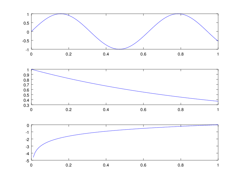
What if you want to show several plots in the same figure? The subplot command automatically sets the position of each set of axes depending on the number of plots and the desired arrangement. The syntax is:
subplot(3,1,1);
plot(x,y);
subplot(3,1,2);
plot(x,z);
subplot(3,1,3);
plot(x,f);
This produces a set of three plots on top of one another, like this:
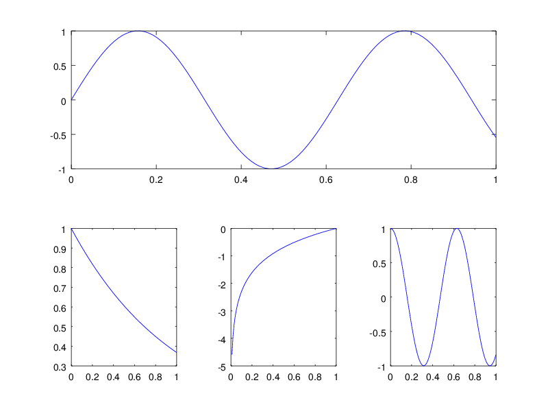
Similarly, subplot(1,3,1); ... will produce three plots side by side. You do not need to call all instances of subplot, which lets you make complicated arrangements:
subplot(2,1,1);
plot(x,y);
subplot(2,3,4);
plot(x,z);
subplot(2,3,5);
plot(x,f);
subplot(2,3,6);
plot(x,g);
makes a large plot on top, and 3 plots side-by-side in the lower part of the figure:
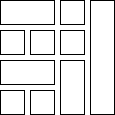
Try making the following figures with multiple plots:
- A 3x3 grid of plots.
- The arrangement below:
Limits, Labels, Titles, and Legends
To change axis limits, use the command axis. axis takes one argument, which is a vector of length 2, 4, or 6. If only 2 arguments are given, it sets the minimum and maximum \({x}\) limits to those values. Adding additional pairs of numbers specify \({y}\) and \({z}\) limits. You can also use xlim, ylim, and zlim, each of which takes a vector of length 2. There are additional options for the axis command, see help axis.
To label an axis, use the xlabel, ylabel, or zlabel command, which takes a string as its argument, and sets the appropriate axis label to this string. You can also specify details about the label (font size, font name, etc.), which we discuss further when we talk about graphics handles. Similarly, you can title your graph using the title function, which takes the same arguments as the label commands.
To add a legend to a graph, use the legend command. legend takes one string per line that appears on the plot, and labels that line in the legend using that string. You can also specify additional parameters in the legend call; one that is particularly helpful is the 'location' parameter, which tells MATLAB where to draw the legend. Usually it tries to find the place it thinks is best (the default value for 'location' is 'best'), but you can specify 'north', 'south', 'east', 'west', and all combinations like 'northwest', which place the legend in various places in the figure. Experiment with legend to understand how it works.
Exercise: Take one of your basic plots from above, and add an \({x}\) label, a \({y}\) label, a \({z}\) label (for one of the 3D plots), and a title. Add a legend to the plot with the four curves with different line styles.
Graphics Handles and Customization
You can customize your plot using the MATLAB user interface using the plot tools. From an open plot, click on the “plot tools” icon on the figure window, which will dock your figure window into the user interface. The plot tools interface lets you choose all kinds of options (font size, font name, tick locations, tick sizes, legend placement, whether to draw a grid or not, line thickness, etc.). There are many, many options to choose from (more than I can list here), and you can generate plots with a variety of styles.
Spend some time changing different parameters using the plot tools to understand how to customize a plot. In particular, make the following changes to some of your previous plots:
- Change the line thickness
- Change the frequency of the axis tick marks
- Add secondary tick marks
- Add grid lines
- Change the font
- Change the font size
- Change the marker edge and fill colors on your
scatterplot - Change the legend location
- Change the colorbar location on a 3D plot
In my opinion, the default MATLAB plots make it easy to make plots that are hard to read. The biggest problem is that the default font size is always too small, nearly independent of the intended destination of the plot (poster, journal article, presentation, web). I have no idea why they insist on making 10 pt font the default, especially when they make the default figure size so big and make it difficult to change the size of the figure. The plots in this document use the default values, and I think they are difficult to read when resized for a document like this. In my opinion, you should always increase the font size of a MATLAB plot, which you can see in some of my examples.
While the plot tools are great for getting a figure to look the right way, the downside to using them is that you have to repeat yourself. As I have tried to emphasize thus far, automating things saves you time and makes your results reproducible. To see why this would be useful, let’s say that you have just spent 15 minutes making your plot look just “so” using the plot tools and you happily head to your advisor’s office to show off your work. After discussing for a bit, you both decide that while the plot looks very nice, it would really be best if you made a small change to the plot. If you do not have a way to automate the tweaks to the figure, you will have to spend 15 minutes producing the figure again.
There are several ways to help make your results more reproducible:
MATLAB includes a
.figformat for saving figures, which lets you open a saved figure directly in MATLAB. This is useful if you just need to tweak the formatting of the plot, add a legend, etc., but won’t let you directly change anything about the underlying data in the plot. This is more akin to saving your work than actually automating production of your figure, so while it is a good idea, I don’t recommend this approach.If you save your figure as a
.figfile, one way you can help make your figure reproducible is to use the “Generate code...” option under the “File” menu. This will create a MATLAB m-file based on the.figfile to re-do all of the figure formatting. Once you have the m-file, you can use that as a script to automatically generate plots with the same customizations. This won’t necessarily help you automate generation of your original figure, but if you used a MATLAB function or script to generate the original (unformatted) plot, you can combine the original code and your tweaking code to automatically re-create your figure that you worked hard to make in the first place.As long as you don’t mind spending the time using the plot tools to customize the plot the first time, this is a good practice to follow to avoid doing extra work every time you make the same figure.
You might have some tweaks you like to put in every figure, such as increasing the font size by defauly. You would need to put those in using the plot tools every single time you save a plot before creating the m-file, then running that code again. It’s a bunch of extra work, and such customizations are tailor made for using a function.
One way around this is to write a MATLAB function that you call when making your plots that does this customization for you. This is easy to do once you have created an m-file based on a .fig file, as an m-file can be easily turned into a function. Just have the lone argument to the MATLAB function be the figure number (use
gcfif you aren’t sure what the right number is), and have the function return the same figure number. This will allow you to repeadly apply common formatting commands without extra work.However, the best approach in the first place is to automate graphics customization when writing your original code. This requires knowing some basics about MATLAB’s rather opaque graphics handle system. It takes a bit of work to become familiar with them, but if you want to be a real pro at producing nice plots with MATLAB, it is really the best method.
I use the graphics handles whenever I make a plot in MATLAB, as it allows me to fully control how my figure looks and do it reproducibly and in an automated fashion. I will always include such commands in my versions of MATLAB code (both in-class and homework solutions), so that you can see examples as to how it can be used. While you don’t need to understand any of this at all to be a proficient user, if you are curious what my plotting commands mean, knowing how graphics handles work will clarify what I am doing.
I have included a few documents that give useful tips on using graphics handles on the class website. One is an article explaining some basics of MATLAB graphics handles (“Matlab_Graphics.pdf”), and another is a MATLAB script (“graphics_handle.m”) that gives several examples of customizations with comments explaining what I am doing. Read those more carefully to get an idea of what you can do with MATLAB.
The short version of graphics handles:
- Everything (figure, axes, line, markers, patches, text) has a handle, a unique number that MATLAB uses to identify that object. This is the same concept as the integer that identifies a file.
- Everything fits into a hierarchy of parents and children. All axes are children of some figure, and all lines are children of some axes.
- Once you have the handle, you can see what properties that object has by typing
get(h), wherehis the handle (integer number) referring to that object. - To see only the value of a specific property, type
get(h,'<property>'). - To set the value of a specific property, type
set(h,'<property>',<value>). If you don’t know what values the property can take, typeset(h,'<property>')without providing a new value for the property. - If you don’t know the handle of the current figure, axes or object, you can get it using
gcf(figure; short for “get current figure”),gca(axes), orgco(object). This is always the most recent figure, axes, or object that was modified from the command line.
Feel free to play around with handles of various objects and see what their properties are and how you set them. If you don’t mind using the plot tools, feel free to skip over this – I was a proficient MATLAB user for many years without knowing one bit about how to use graphics handles, though I learned more as I started to automate more and more of the work that I was doing. Regardless of how you decide to do it, be sure that any plot that you create can be reproduced in some automatic fashion (it will save you loads of time and effort).
Saving and Printing
Finally, how do you save your graphics in a format that can be used for another purpose? I mentioned previously that you can save a figure from the figure window, and that you can choose any number of formats. If you want to save a file from the command line (to put it into a script so that you can automate and reproduce things), the print function is very useful. The basic syntax is print '<driver>' '<name>', where <driver> specifies the type of file that you would like to save (or the type of printer that you desire to use for output). print can also be called as print('<name>','<driver>') or print(<handle>,'<name>','<driver>') to print a specific figure based on its handle. The most common formats will be -dpdf for PDF output, -deps for black-and-white Encapsulated PostScript (EPS), -depsc for color EPS, and -dpng for PNG files. Since PNG is a pixel-based format, you can give an optional -r<number> to specify resolution in pixels per inch (the default is 150). Any of these are fine for your homework – if you care about the technical differences between any of them, I am happy to explain.
So for example, to save the current figure as a PDF, you would type print '-dpdf' 'figure.pdf' or print('figure.pdf','-dpdf'). To save the current figure as a PNG with a resolution of 100 ppi, you would type print '-dpng' '-r100' 'figure.png' or print('figure.png','-dpng','-r100'). To save the figure with handle h as a color EPS file, use print(h,'figure.eps','-depsc'). Try saving the figure that you have made in this lab using this method.
Additionally, MATLAB has the saveas command, which works in a similar manner as print. The syntax is slightly different: saveas('figure.pdf','pdf'), saveas('figure.png','png','r100'), or saveas(h,'figure.eps','epsc'), but you should be albe to achieve the same results as using print.
I have provided some examples of using the print and saveas commands in the same m-file where I illustrate graphics handles.